The Portal User View
This section will explain all panels and dialog in depth. Both regarding how you use it but also the limitations and some reasons to why it looks like it does. Section 3.1 will describe the meaning of the four top level panels. In section 3.2 through 3.5 each top level panel will be described in detail.
Top level tabs
On the top level there are four different tabs to choose from. From left to right they are:
- Active Tasks This tab represents the tasks that the user has started and at least one of tasks in the car is in a running, pending or error state. When all car tasks are in a stopped state, that task is removed from the list of active tasks. With this strategy you can be sure that once a task appears in the list, not all assignments have status stopped.
- Search Tasks The tab is self explanatory to the extent that this is what you really do here, search among tasks.
- Vehicles Manages your vehicles. As vehicles belong to users of the system, you need to assign a vehicle to yourself before you initiate tasks running on it. You can also deassign vehicles when you are finished with them.
- Administration In this tab you can administer your name, email-address, password and a few other things.
With these four tabs you can do all the work that is needed to start, stop and handle data to and from vehicles. A figure of the tabs is presented in Illustration 11 below.
This will probably be one of your mostly used tabs. You administer all tasks from this tab, both new and currently running. Most aspects have already been covered in chapter 2.3 but now follows a more comprehensive description.
General Tab Layout
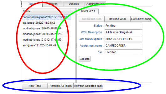
The layout of this tab is presented in Illustration 12 below. It is basically divided into 3 sections, one to the left, one to the right and one at the bottom. To the left we have the red section. This is a simple column showing the tasks that are active. It can be arbitrarily long, but a scroll list will show when the window size is to small to accommodate all tasks. By clicking any of the tasks the section to the right of that column, the green section, will fill with WCUs running this particular task. Each tab in the green section corresponds to an individual WCU. By clicking the desired tab, that WCU's data is brought up in the green section. Lastly, there is the bottom section, or the blue section, containing buttons that relate to tasks.
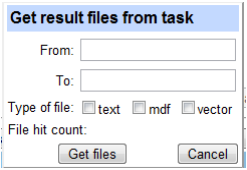
In addition to clicking on a task to see each WCU that runs the corresponding hub assignment, you can right click the task to bring up a menu where the only choice is “Get result files”. Selecting that entry brings up a dialog where you can choose to download all result files from every WCU that is running the task. You must enter a from and to date and type of file to narrow down the number of result files. The dialog is presented in Illustration 13, below. Clicking in the from or to field brings up a date selection popup dialog. You can always edit the date in the text box afterward or simply skip using the date pop-up. As the number of files can be rather large and hence the size of the downloaded file can be large an indication of that is given in the entry “file hit count”. This number reflects the number of files that will be downloaded once you hit the “Get files” button. If you change your mind you can always click “Cancel” to abort. The downloaded file is always named wice.zip. This functionality can also be found in the “Search tasks” tab by right clicking in the TaskID column.
Search Tab
For info, see Search Tab
Vehicles Tab
For info, see Vehicles

