Difference between revisions of "Key Figures"
m (Changed from term "assignment" to "task" and updated the introduction of the different types of statistics) |
|||
| Line 8: | Line 8: | ||
The statistics are presented in stacked column charts, examples of which can be seen i in Figures "Key Figure Chart 1" and "Key Figure Chart 2". The foremost mentioned points out three basic functionalities. In the upper left corner there is a drop down menu for selecting the time sampling interval. Next to it there is a checkbox which can be used to enable/disable stacking the bars of the chart. In the upper right corner you find a menu used for export of the chart image and data. Finally, below the chart there is a clickable legend which can be used to select and deselect the available data series. "Key Figure Chart 2" points out three different manners in which it is possible to zoom. In the upper left corner there are options which can be used to zoom to 1- 3- or 6 months, from the start of this year to this day "YTD", view one year or the entire interval in which there is data, "All". This selected time interval can also be moved around using the navigator marked out in the bottom of the chart, which also can be used to resize the interval. In the upper right corner you find a date selector used to display data in between certain dates. | The statistics are presented in stacked column charts, examples of which can be seen i in Figures "Key Figure Chart 1" and "Key Figure Chart 2". The foremost mentioned points out three basic functionalities. In the upper left corner there is a drop down menu for selecting the time sampling interval. Next to it there is a checkbox which can be used to enable/disable stacking the bars of the chart. In the upper right corner you find a menu used for export of the chart image and data. Finally, below the chart there is a clickable legend which can be used to select and deselect the available data series. "Key Figure Chart 2" points out three different manners in which it is possible to zoom. In the upper left corner there are options which can be used to zoom to 1- 3- or 6 months, from the start of this year to this day "YTD", view one year or the entire interval in which there is data, "All". This selected time interval can also be moved around using the navigator marked out in the bottom of the chart, which also can be used to resize the interval. In the upper right corner you find a date selector used to display data in between certain dates. | ||
There are currently | There are currently 7 statistical charts available: "New Resources", "Amount of Data per Resource", "Total Amount of Data per File Type", "Amount of Data per File Type", "Amount of Data per Task Type", "Number of Uploads per Resource" and "Number of Uploads per Task Type". | ||
=== New Resources === | === New Resources === | ||
| Line 22: | Line 22: | ||
In this chart it is illustrated how the amount of data per file type has varied over time. | In this chart it is illustrated how the amount of data per file type has varied over time. | ||
=== Amount of Data per | === Amount of Data per Task Type === | ||
This chart visualizes the variation of the amount of uploaded data per | This chart visualizes the variation of the amount of uploaded data per task type over time. | ||
=== Number of Uploads per Resource === | === Number of Uploads per Resource === | ||
In this chart, the number of uploads per selected resources is presented over time. To select resources, use the WCU selection window by clicking the ''Select WCUs''-button, see Figure "Key Figures Tab". | In this chart, the number of uploads per selected resources is presented over time. To select resources, use the WCU selection window by clicking the ''Select WCUs''-button, see Figure "Key Figures Tab". | ||
=== Number of Uploads per | === Number of Uploads per Task Type === | ||
This chart illustrates the number of uploads per | This chart illustrates the number of uploads per task type over time. | ||
Latest revision as of 17:01, 25 November 2021
From version 2.51 the concept of key figures has been introduced in the WICE portal.
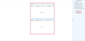
Statistical key figures regarding regarding resource creation and data upload is graphically presented in the Key Figures Tab found under the Administration Tab, see Figure "Key Figures Tab". To the left there is a hidable which is used to view/hide the available statistical charts and to pop up a Select WCUs-window, the button for which is marked in red on the panel. When clicked, the window, marked out in the middle of the image, appears containing a panel for selecting WCUs for the resource dependent key figures. In this panel, resources are selected either through drag-and-drop or by the use of the arrow-buttons.
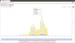
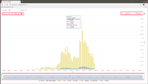
The statistics are presented in stacked column charts, examples of which can be seen i in Figures "Key Figure Chart 1" and "Key Figure Chart 2". The foremost mentioned points out three basic functionalities. In the upper left corner there is a drop down menu for selecting the time sampling interval. Next to it there is a checkbox which can be used to enable/disable stacking the bars of the chart. In the upper right corner you find a menu used for export of the chart image and data. Finally, below the chart there is a clickable legend which can be used to select and deselect the available data series. "Key Figure Chart 2" points out three different manners in which it is possible to zoom. In the upper left corner there are options which can be used to zoom to 1- 3- or 6 months, from the start of this year to this day "YTD", view one year or the entire interval in which there is data, "All". This selected time interval can also be moved around using the navigator marked out in the bottom of the chart, which also can be used to resize the interval. In the upper right corner you find a date selector used to display data in between certain dates.
There are currently 7 statistical charts available: "New Resources", "Amount of Data per Resource", "Total Amount of Data per File Type", "Amount of Data per File Type", "Amount of Data per Task Type", "Number of Uploads per Resource" and "Number of Uploads per Task Type".
New Resources
This chart shows how many new resources which have been created over time.
Amount of Data per Resource
This chart displays the amount of data in MB uploaded for selected resources over time. To select resources, use the WCU selection window by clicking the Select WCUs-button, see Figure "Key Figures Tab".
Total Amount of Data over File Type
Here you find how the total amount of data is distributed over the different file types, also here in MB.
Amount of Data per File Type
In this chart it is illustrated how the amount of data per file type has varied over time.
Amount of Data per Task Type
This chart visualizes the variation of the amount of uploaded data per task type over time.
Number of Uploads per Resource
In this chart, the number of uploads per selected resources is presented over time. To select resources, use the WCU selection window by clicking the Select WCUs-button, see Figure "Key Figures Tab".
Number of Uploads per Task Type
This chart illustrates the number of uploads per task type over time.


